The Overview is the first page you see when you open a project. It answers one question: is everything fine right now, and if not, what needs attention?
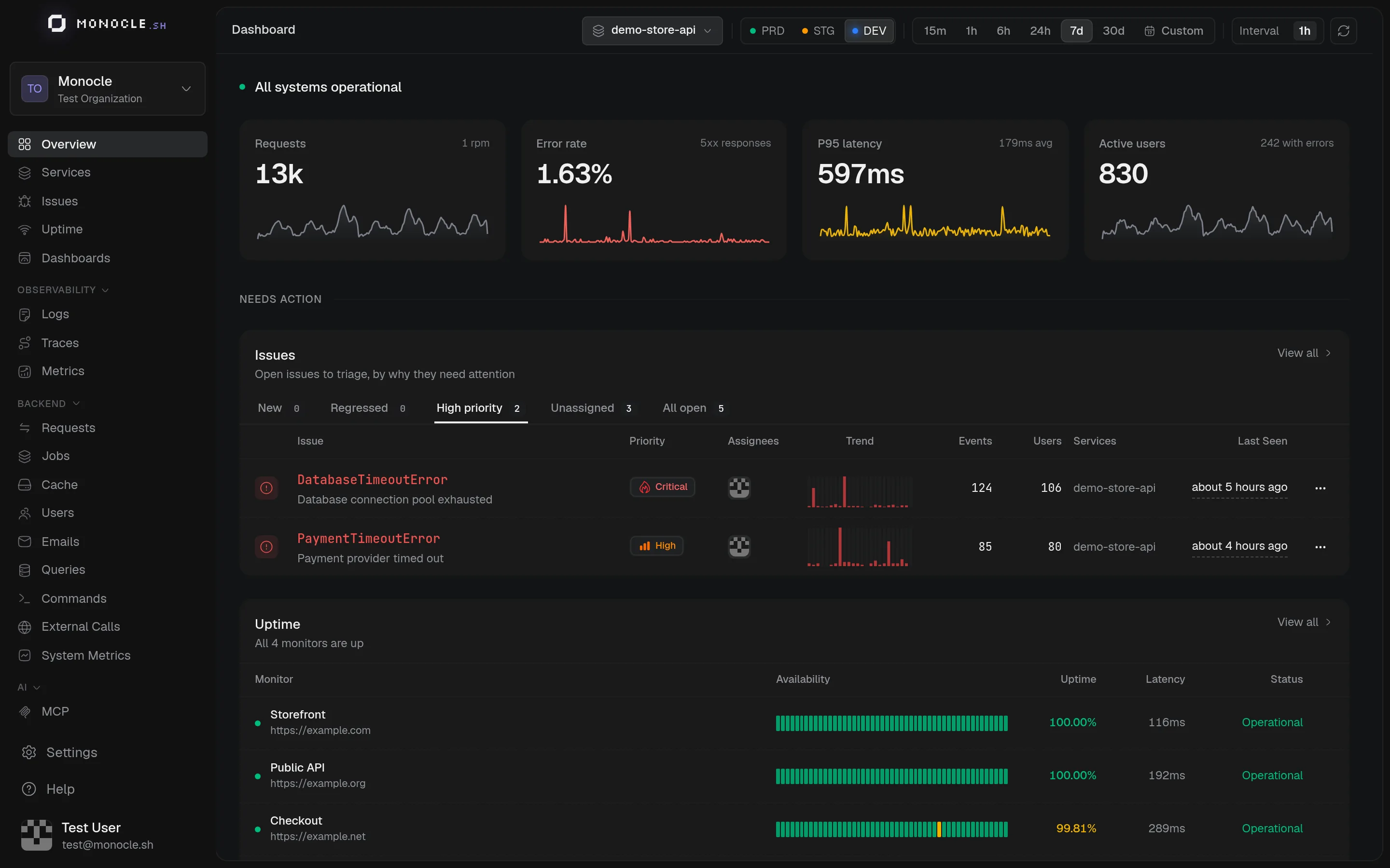
What's on the page
-
Status line: a one-line summary at the top, such as "All systems operational", a count of monitors that are down, or issues that need triage.
-
Key numbers: requests, error rate (5xx responses), P95 latency, and active users for the selected range, each with a sparkline.
-
Needs action: open issues sorted into tabs, so you can triage by reason.
Tab Shows New Issues seen for the first time in this environment Regressed Resolved issues that came back High priority Open issues with a High or Critical priority Unassigned Open issues nobody owns yet All open Every open issue -
Performance: traffic by status code with P95 latency, and a Services table with throughput, error rate, P95 latency, and exceptions for each service. A red dot means at least 5% of requests return 5xx, amber means at least 1% or some exceptions.
-
Uptime: the state of your uptime monitors.
Every block links to the page with the full details.
Controls shared by every page
The header of each dashboard has the same three controls.
Service filter
All services shows data from every service of the project. Select one or more services, up to 50, to narrow every chart and table. The selection is kept in the URL and follows you from page to page, so a copied link keeps it.
Environment
The PRD, STG, and DEV buttons switch between the production, staging, and development environments. Every page only shows the data of the selected environment. Switching environment takes you back to the Overview of that environment, except on the Issues list.
Time range and interval
Pick a preset (15m, 1h, 6h, 24h, 7d, 30d) or Custom to choose dates on a calendar. Each preset also sets a sensible Interval, the size of each bar or point in the charts, which you can change from the dropdown next to it.
The time range is remembered in your browser between visits, but it is not part of the URL. Someone opening a link you shared sees their own time range. Data is not refreshed automatically: use the refresh button on the right to load the latest data.
Long ranges like 7d or 30d are the best way to spot trends, daily patterns, and regressions after a deploy.