Custom Dashboards put the metrics you watch side by side: charts, latest values, and breakdowns, all over the time range selected at the top of the page.
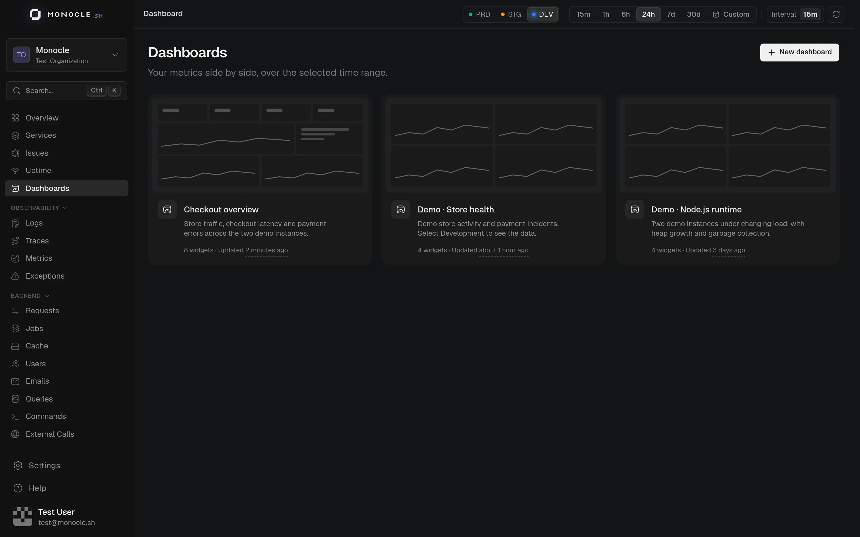
Each card shows a miniature of the dashboard's layout, its description, and how many widgets it has. Use the … menu of a card to rename or delete the dashboard.
Read a dashboard
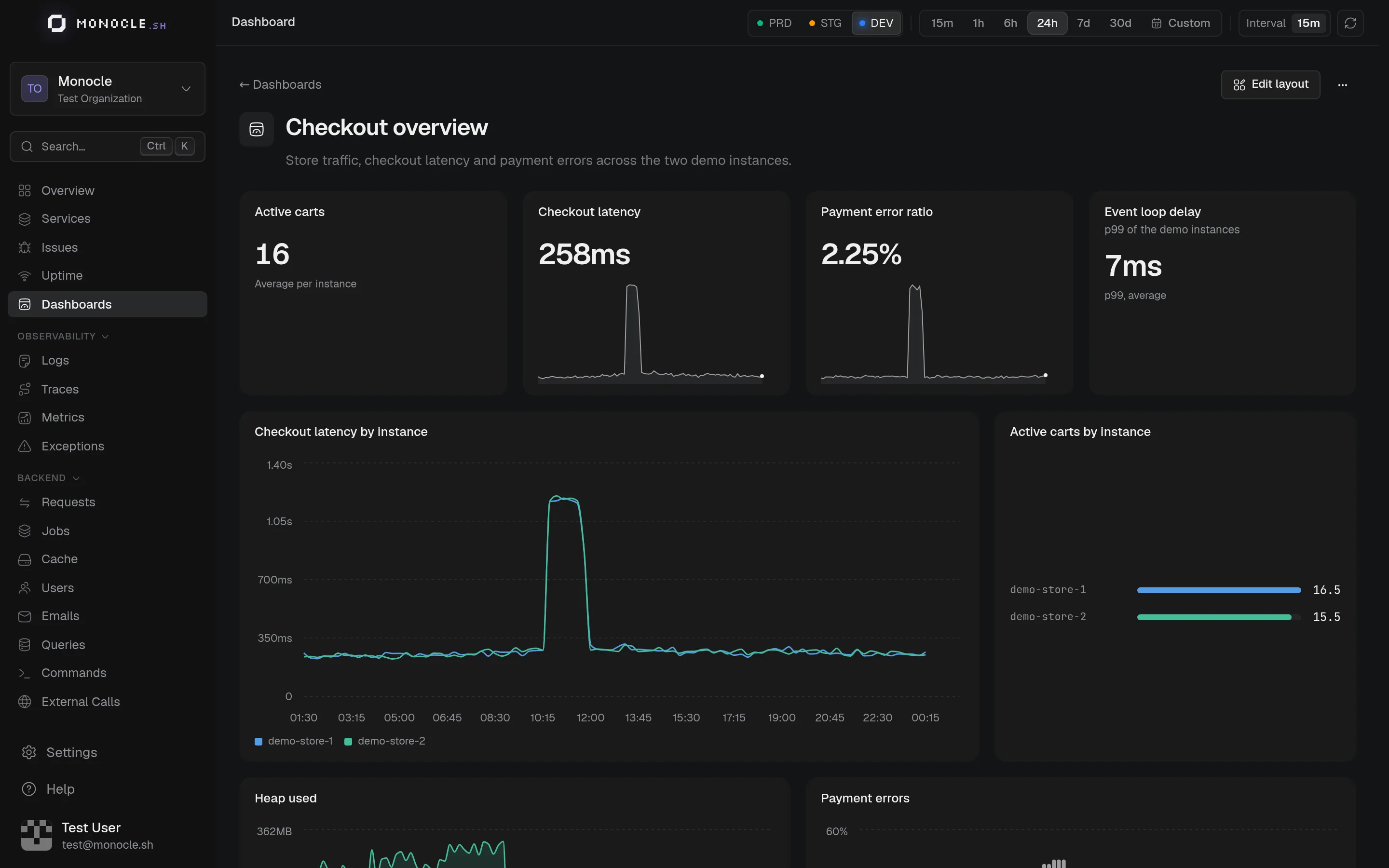
Widgets follow the time range and environment selected at the top of the page. Hover a widget to show its actions:
- Open in Metrics: opens the metric of a single-query widget on the Metrics page, with the same aggregation, grouping, and filters.
- Edit widget, Duplicate, and Remove: switch the dashboard to editing.
When a widget can't load its data, it shows the reason instead of an empty chart.
Widget types
| Type | Shows | Default size |
|---|---|---|
| Time series | Values over time, as lines, areas, or bars | 6×5 |
| Stat | The latest value | 3×3 |
| Sparkline | The latest value over its trend | 3×3 |
| Bars | The latest value of each group, ranked | 4×5 |
| Pie | The share of each group | 4×4 |
| Table | One row per time bucket, one column per group | 6×5 |
Bars and Pie compare several series: group a query by an attribute, or add more queries.
Edit a widget
Click Edit layout, then Add widget, or Edit widget from the menu of an existing one.
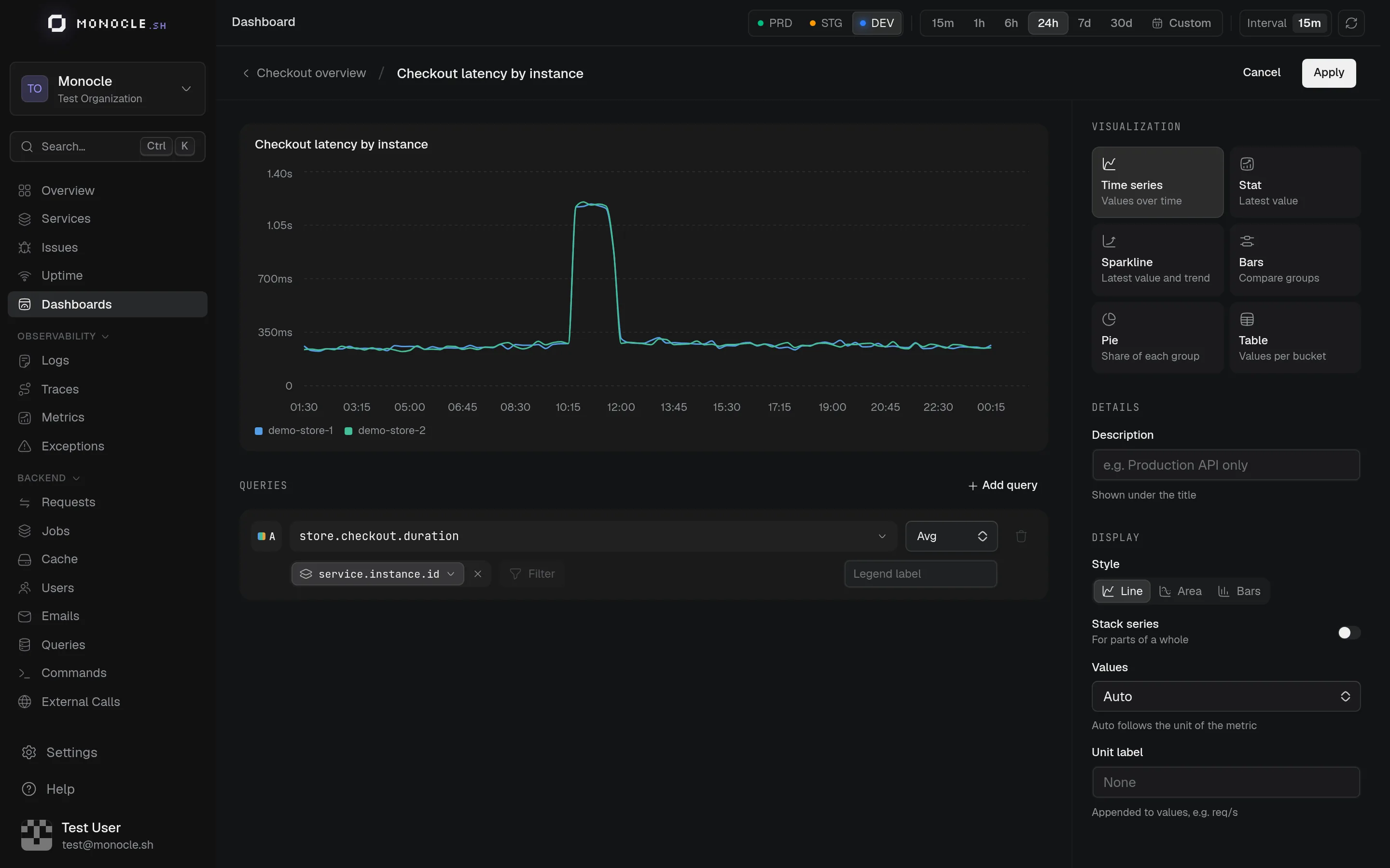
Type the title at the top. The preview updates as you change the widget, over the time range of the page.
Each query reads as a sentence: a metric, an aggregation (average, sum, count, min, max, rate, or percentiles, depending on the metric type), an optional group by attribute, and filters on attribute values. Add up to six queries to compare metrics in the same widget. Click the letter of a query to pin its color, and give it a legend label if the metric name is not clear enough.
On the right:
- Visualization: one of the six types above.
- Description: shown under the title.
- Style and Stack series: for time series.
- Values: Auto formats each query from the unit of its metric (durations, bytes, percentages). Force Number, Duration (ms), Percentage (0–1), or Bytes when the unit is missing.
- Unit label: appended to values, such as
req/s.
Apply brings the widget back to the dashboard. If something is missing, hover the button to see what.
Layout
Dashboards use a 12-column grid. While editing, drag a widget by its title and resize it from its bottom-right corner. Save keeps the layout and the widgets, Cancel drops every change since you started editing.
A few tips for clean layouts:
- Widgets on the same row should have the same height to avoid gaps
- Stat and sparkline widgets work well as a row of 4 (3 columns each)
- Time series and tables pair nicely as two per row (6 columns each)
Manage dashboards from your AI assistant
Custom dashboards are fully manageable through the Monocle MCP. Your AI assistant can create dashboards, add widgets, and update layouts programmatically.
| Tool | Description |
|---|---|
list_dashboards | List all custom dashboards |
get_dashboard | Get a dashboard with all its widgets |
create_dashboard | Create a new empty dashboard |
update_dashboard | Update name, description, or icon |
delete_dashboard | Delete a dashboard and all its widgets |
add_widget | Add a widget with metric, visualization, and layout config |
update_widget | Update an existing widget |
remove_widget | Remove a widget |
Example: "Create a dashboard called API Health with charts for request latency, error rate, and throughput"